
October 2025 Release - Behind the Tech
Oct 15, 2025
If you’ve missed the release post or have come directly to this post, I’d like to urge you to read that post as it covers highlights of what’s about to be discussed here.
Apple Intelligence
In the release post: I mentioned I wanted to take a different approach towards using Apple Intelligence in Pockity. I wanted to progressively enhance the user’s experience without any impact on their day-to-day tasks in Pockity. I wanted to use the SystemLanguageModels in a way that’s obvious, but completely opaque to the user. I wanted to remove the one click or tap that most apps employed.
That’s a lot of wants! But it’s entirely possible once you prototype a single feature over four months, tweaking and updating it, simplifying it down to its essential parts.
Pockity uses Apple Intelligence, as of this update, in two key places:
1. Receipt Parsing

The receipt parser in Pockity employed the following technologies:
- Vision: Document scanning, including boundary detection, and text recognition
- DocumentObservation: For detecting structured text in receipts
- Swift: Well, of course!
These work seamlessly, in order of their listing, to produce a simple result for me to use in the end:
final class VisionData: Sendable, Observable {
  let amount: Double?
  let date: Date?
  let locationName: String?
}
What ever is detected, gets added to the result, and returned. The System Language models could do a lot more based on natural and structured language parsing, than I could possibly train using CoreML. This additional information and metadata is very useful, especially because it’s searchable in the apps.
Using System Language models, the receipt parsing process can now additionally extract a lot more information, obviously dubbed a PKInvoice in the app:
@available(iOS 26.0, macOS 26.0, *)
public struct PKInvoice: Codable, Equatable {
  /// Invoice number or ID
  public let invoiceNumber: String

  /// Invoice issue date
  public let invoiceDate: String

  /// Invoice issue time
  public let invoiceTime: String?

  /// Seller/vendor information
  public let seller: Seller

  /// Individual line items
  public let lineItems: [LineItem]

  /// Subtotal before tax/discount
  public let subtotal: Double

  /// Discount information if any
  public let discount: Discount?

  /// Tax information
  public let tax: Tax?

  /// Total amount due
  public let totalAmount: Double

  // Nested Types //
}
All relevant items which get parsed get added to the notes field on an entry. The code that actually handles parsing this text for me, including availability checks, error checking, guards, etc. is just 70-lines of code. Testing this is trivial too, to ensure that the same input yeilds the same output over and over again maintaining consistency between runs.
This now means the updated VisionData class looks something like this, and as always, any field that is nil is skipped, and can be configured in the entry editor.
final class VisionData: Sendable, Observable {
  let amount: Double?
  let title: String?
  let date: Date?
  let locationName: String?
  let notes: String?
}
2. Category Expense Predictions
Similar to the above setup, predictions for category expenses based on past data was approached in the same way, ensuring the same input yielded the same output when run over and over again to ensure consistency.
This one however, is setup in the app slightly differently: Pockity has a lot of things to do: sync your data, maintain transaction orders for ledgers, update balances, update widgets, fetch latest ForEx data, maintain and update backups, and a whole lot more… All of these are broken down into tiny tasks that run in the background, when you’re using the app, and while you’re not when it’s charging using background tasks.
The Category expense predictions code is also isolated to its own task, which runs when ever a user runs CRUD operations affecting a category. It employs a linear debouncing timer to ensure it runs only once across many invocations.
This feature however needed to work for regions where Apple Intelligence isn’t available yet, so I’ve worked on a tiny statistical utility used for these predictions. Now, there is a difference in the outputs between the two methods, so I’ve left to the user to decide which one they want to use in-case both are available to them.
This gets stored and synced by the app using a simple structure which references the generated predictions based on the category’s identifier:
public final class MLCategoryPredictionsMO: NSManagedObject {
  public typealias DataType = [UUID: [Date: Double]]
  /// Track when this data was last generated.
  ///
  /// Automatically generate, at-most, once a day, and always generate on-demand when user-ops occur.
  @NSManaged public var lastUpdate: Date
  // Simplified for the purpose of this post
  @NSManaged public var predictions: DataType?
}
I’d only ever want to automatically generate new predictions once a day, unless the user makes any changes as I mentioned above.
Dictation
I’ve loved using dictation on my iPhone ever since its debut as a keyboard function for inputs. I’ve used it numerous times, if not always, when creating new entries using Pockity’s NLP.
With iOS 26, and macOS 26, Apple released a key piece of this technology called SpeechTranscriber which was widely talked about during WWDC.
However, during my initial prototypes, I discovered this was extremely slow for the purpose of drafting new expenses. I wanted this experience to be really fast, just like the iOS keyboard. I quickly gave up on this idea, an idea that was suggested to me last year in September. Three months later though, I found this gem listed on the documentation website: DictationTranscriber. And directly from its documentation:
A speech-to-text transcription module that’s similar to system dictation features and compatible with older devices.
Bingo! That’s exactly what I was hoping to have, and that’s exactly what Apple has delivered here. There are some good blog posts out there which go into detail of implementing SpeechTranscriber and its cousins. The implementation remains mostly similar for DictationTranscriber albeit with fewer technical limitations.
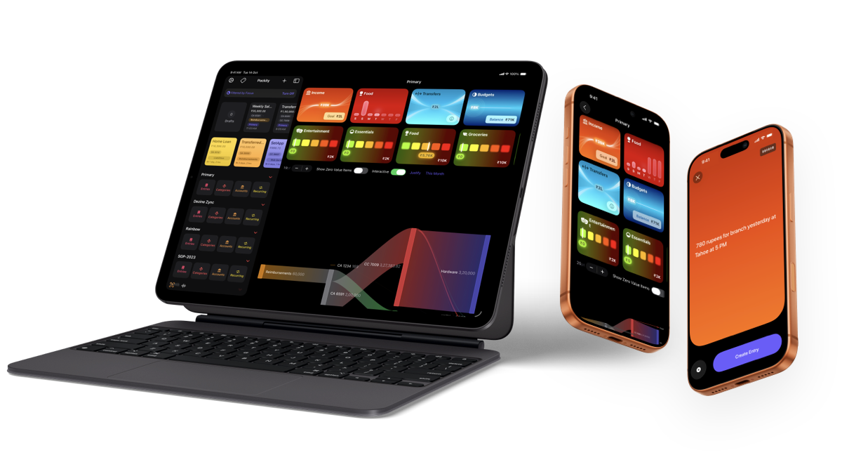
Widgets
Building the new widgets was the most fun! I started off with prototypes in Sketch, imagining not only how they looked, but also how they would relay more information than what the text in them leads to show!
Graphs were the easiest: Graphs are self-explanatory, and don’t depend on additional cues unless you want to use them.

A small little foundational change for these widgets was implemented way back in April 2025 Release which brought support for assigning icons to categories and accounts, and these icons get used by the new widgets.
I prefer making these small incremental changes to app, giving users time to explore and adapt to new things, slowly making their way to larger concepts and features in the app, so it doesn’t overwhelm them. Introducing all changes in one giant update is an easy way for users to miss out on things.

The Income widget was the first to be prototyped and tested. I did not know .glassEffect() did not work for Widgets. There is no mention of this in the documentation (at least it wasn’t there when I began working on these) and it completely caught me off guard. My prior designs and prototyping (my mistake, I used the Mac and iOS Simulator as targets) completely relied on using using the glass effect modifier. My next best option was to mimic it as closely as possible using alternatives and I ended up liking both versions.
This means a lot more #ifs throughout the code, and I’m okay with that if it helps me achieve better results!
Using AppIntents to handle widget states was also something new I explored. Users can now view their income for the current week as well as their goal, and expand to see their income over the month by expanding it.
Once I had these few common elements nailed down, working on the rest of the widgets was straightforward. All shapes, lines and strokes, are either basic Line views or CGPath backed shapes. Since these needed to work with using the same code on varying widget sizes, complications, and in the apps: I extracted common code and offset the path origins and nodes based on some simple math:
func linePaths(in size: CGSize) -> [LinePath] {
  // The original width from the design assets
  let originalWidth: CGFloat = 182
  let targetWidth = size.width

  // Calculate scale factor for x-axis
  let scaleX: CGFloat = targetWidth / originalWidth

  // Define origins
  let originX: CGFloat = verticalSizeClass == .compact ? -11 : 0
  #if os(watchOS)
  let originY: CGFloat = size.height / 3.2
  #else
  let originY: CGFloat = -14
  #endif
  ...
  ...
  let somePath = CGMutablePath()
  somePath.move(to: CGPoint(x: (0 * scaleX) + originX, y: 116 - originY))
  somePath.addCurve(
    to: CGPoint(x: (65 * scaleX) + originX, y: 67 - originY),
    control1: CGPoint(x: (18 * scaleX) + originX, y: 83.3333333 - originY),
    control2: CGPoint(x: (39.6666667 * scaleX) + originX, y: 67 - originY)
  )
  ...
}

The Transfers widget follows the same pattern for building out these widgets, reusing all the sub-components I’ve prototyped, custom paths, and the data views.
This pattern repeats itself for the next widgets I’ll be discussing… And this where I started having a lot of fun designing these widgets.
The Budgets widget shows two key bits of information: The total budget across all the user’s budgeted categories and the currently utilised budget. Static information, but they can be made a lot more visually appealing utilising a progressive blur metal shader, some strokes and layered blurs, and some glow.
By layering these, creatively using SwiftUI’s overlay(alignment:content:) modifier, I built up a system to present key information in a glanceable way with the background and surrounding elements providing hints to the user.
I then took this system a step further with the Budget widget. I then used progressive blur to indicate where the user is with their budget for a specific category. If you notice closely in the above video, the five colour blocks use variable blur levels as the amounts and their ratio changes. These aren’t random levels. At the least spend ratio, where the budget limit is far away, the redder blocks blur out and fade away from their user’s focus, immediately navigating their eye to the beginning of the budget. As the spend ratio approaches the middle, the horizontal edges are blurred, but not too much as to drive focus away, and finally towards the end or excess of the budget, the greener blocks fade out.
Opacity is a good trick, and works great in some cases, but for a truly captivating & glanceable design, combining the two: opacity, and progressive blurs, really helps with hinting to the user, what is being displayed without using words.
Now if you notice, there is one common element between the widgets: The little capsule that displays the main data element in the widget. It’s called PKMNGlowingView in the project. And in the budget widget video, it adapts and changes colour based on its background. In fact, through out all the widgets, it uses a hue unique to the widget.
Another thing I’d like to draw your attention you: If you’re reading this post on a device capable of displaying HDR (at least P3 or Rec 2020) colour spaces, you will notice the colours are more vibrant and brighter.
During my prototyping, I realised if I could base my widgets views around a hue value which I could pass through to the subviews for composing them, I could control how they render very accurately. The brighter and vibrant colours come from using a simple thing now available in SwiftUI:
Color(hue: 240/360.0, saturation: 1.1, brightness: 1.2)
This will give you a very bright blue! And the values above 1.0 aren’t a mistake, that’s how you can push colours to appear in the high-dynamic range most modern Apple devices support. You can further inspect how these are resolved for HDR using Color.ResolvedHDR. Using this also gives me confidence that the colours will be generated uniformly, as compared to using RGB values for them. So the budget widget, I define the colours like so, using constant saturation and brightness values:
Color(hue: 84 / 360.0, saturation: 1.3, brightness: 0.36)
Color(hue: 64 / 360.0, saturation: 1.3, brightness: 0.36)
Color(hue: 44 / 360.0, saturation: 1.3, brightness: 0.36)
Color(hue: 24 / 360.0, saturation: 1.3, brightness: 0.36)
Color(hue: 04 / 360.0, saturation: 1.3, brightness: 0.36)
The colours in this widget are constant. So let’s take a look at the colours for the Expenses widget which come from the category. In the initialiser of the widget, I extract the hue using the relevant API and then use this value throughout my view and its subviews.
init(category: CategoryMO) {
  var hue: CGFloat = 0
  category.color.getHue(&hue, saturation: nil, brightness: nil, alpha: nil)
  self.hue = hue * 360
  ...
}
I convert the hue value back to a degrees representation so I can reason with more comfortably in code when I later do something like this:
Capsule()
  .fill(Color(hue: (hue - 14)/360.0, saturation: 0.46, brightness: 1.0).gradient))

// elsewhere
PKMNGlowingValueView(..., tint: tint)
The simplest and purest form of dependency-injection, passing a derived value from a colour: to tint, shade, blur, and lighten up all the various components of a simple, glancable widget.
I hope I’ve shared a lot of how these new features were prototyped, designed, built, and refined over the last five months. These new widgets, dictation transcriber, and Apple Intelligence integration moves forward Pockity in a direction I did not imagine until a year ago. It all began a year ago when folks at the Developer Center in Bengaluru (thank you, you know who you are!) suggested the idea of transcribing voice notes to draft entries to me.